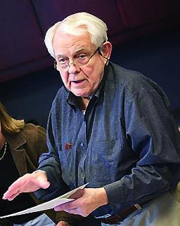
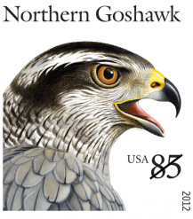
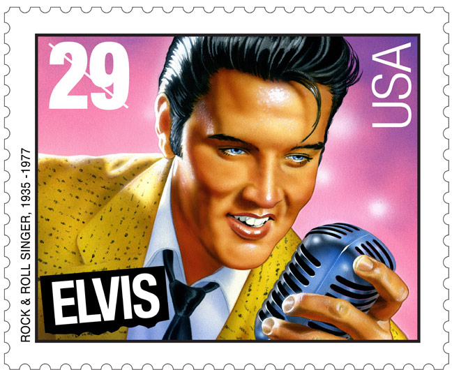
You probably don’t know who Howard Paine was, but you’ve seen his graphic artistry hundreds, probably thousands of times.You’ve seen it if you’ve ever licked a stamp — back in the days when they had to be licked — mailed a letter, or thumbed the pages of National Geographic magazine. For more than 30 years, Mr. Paine was a stamp design coordinator of the Postal Service. For more than 30 years, he also was a graphic artist at the National Geographic Society, retiring as art director. At the Postal Service, Mr. Paine helped bring out the 29-cent Elvis Presley stamp in 1993. After 21 years, it remains the leader in commemorative stamps, with 500 million sold. Mr. Paine also helped create the Ronald Reagan stamp, as well as stamps commemorating the planets, gospel singers, movie stars and comedians. He had a role in the design of 400 stamps in all, according to Terry McCaffrey, the retired manager of stamp development at the Postal Service.
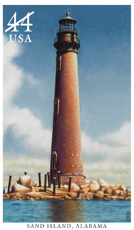
Mr. Paine once declared that he wanted to “do some adventurous things” with stamps. He was the idea man and the persuasive force behind a series of cloudscape stamps that were issued by a skeptical Postal Service. Word of the upcoming series reached the nation’s corps of radio and television weather forecasters. They talked it up in their broadcasts, and the series sold surprisingly well, said McCaffrey, the retired postal official. Howard Erwin Paine was born May 1, 1929, in Springfield, Mass., and he began stamp collecting in childhood. He was a 1950 philosophy graduate of American International College in Springfield. He had no formal design training, but he edited his high school and college yearbooks. He worked in a family electrical business until 1957 and had a short-lived job writing and designing ads for a bank and advertising firm. He also read Advertising Age and other periodicals to keep atop trends in design. With the Postal Service, where he worked from 1981 to 2012, he was best known for his contributions to the Elvis stamp. He supervised several artists in arriving at the final design, which was determined after the public voted overwhelmingly for an image of the “young Elvis” over the “old Elvis.” It was intended as the first in a series of commemorative stamps honoring American music and musicians. Of the 500 million Elvis stamps sold, $26 million worth of the commemorative stamps have not been used and are believed to be in the hands of collectors. Mr. Paine was known for his bow ties and a soft-spoken manner. At staff meetings, he tended to be silent and sometimes appeared to be doodling, former Postal Service staffer McCaffrey said. Then he would stand up, walk over to whoever was leading the meeting, and hand him a napkin or scrap of paper with a stamp design drawn on it. Frequently it was just what was needed. The Washington Post Stamp designer Howard Paine, 'Father Art Director'“Howard was a Renaissance man … he was single-handedly responsible for much of the improvement in the quality of U.S. postage stamp design over the past several decades,” said retired USPS Art Director Richard Sheaff. “Everyone who ever worked with Howard would all agree that he was one of the most wonderfully creative, astute, and humble men we’ve ever met,” said McCaffrey. When tapped for the Citizens’ Stamp Advisory Committee in 1979, Paine already was celebrated as the art director at the National Geographic Society. He served on the committee three years before he was named one of the Postal Service’s six stamp art directors, a role he filled for three decades. By the time of his Postal Service retirement in 2012, Paine had a hand in virtually every major stamp project, handling chores from selecting typography to designing entire sets of stamps. “What a loss!” said CSAC Chair Janet Klug. “I suspect the gorgeous Lighthouse stamps we all love so much, created by collaboration of the two Howards (Paine and the artist Howard Koslow), will forever flash brightly in our albums. Rest in peace, Mr. Paine. You will certainly be missed.” Stamps, Paine said, should be “documents of national character, even if they are tiny.” Under Paine’s direction, stamp designs were treated as high art, objects that could be as small as an inch in diameter yet must remain clear and crisp in design. For his National Geographic magazine covers — and his stamps — Paine liked big heads. “The face is just magic,” he said of his magazine covers.I favored a big head whether it was a pretty girl or a tribal chieftain — even the portrait of an animal. A portrait is a compelling logo.” Presley, Ronald Reagan, Woody Guthrie, Arthur Fiedler, Edward G. Robinson, Leonard Bernstein, Mahalia Jackson, Raoul Wallenberg and even Lady Liberty became big heads on the stamps Paine helped create. “Howard was intrigued with the surprisingly difficult challenge of successfully conveying a message on the very small piece of real estate that is a postage stamp,” said Sheaff. “Always keeping the collector in mind, as well as the general public, he was a dogged advocate for stamps in continuing series, as opposed to isolated single stamps,” he said. Paine argued that collectors wanted stamps in series “because he strongly believed that stamp collectors preferred a series they could follow, anticipate, seek to complete.” “He was a master at making what we in the committee called ‘severed heads’ interesting and attractive,” said former CSAC member John M. Hotchner. “But he was so much more as an artist and as a genuinely nice person,” said Hotchner. “He brought a sense of history and gravitas to his work, and the U.S. stamp program benefited in many ways over many years.” To his fellow art directors at USPS headquarters, Paine was known simply as “Father Art Director,” a reflection of their deep respect for Paine’s ability to resolve design questions, sometimes with a sketch on a napkin. “When he felt he had a good idea, he never wanted to let it go,” recalled McCaffrey. The best example was his concept for a set of stamps based on the shapes of clouds — the 37¢ Cloudscapes stamps of 2004. His fellow art directors were skeptical, but finally agreed to let Paine present the idea to CSAC. The committee was reluctant as well, but allowed the idea to be pursued. Paine’s Cloudscapes stamps of 2004 proved to be so popular that they sold out. “When Howard was informed of the sales figures, in typical Howard fashion, he gave a little smile and with a twinkle in his eye, he humbly said how wonderful that was.” Designs must be correct, Paine said, referring to his work at National Geographic. “It’s got to be accurate. That’s the flag we fly under. The illustrations aren’t decorative or something for a kid’s book.” While Paine was well known to U.S. stamp collectors, the changes that he made at the National Geographic were as dramatic as his stamps. At National Geographic, he swept away the magazine’s staid yellow cover with its border of oak and laurel leaves and replaced them with large, dramatic color photographs. Paine never studied art or design. “I think it was all in my genes,” he told The Washington Post in 2010. At American International College in Springfield, Mass., he was a philosophy major. He later came to Washington to work for National Geographic where he quickly became known as a “design whiz.” Moving at what he once called “glacial” speed, he got the magazine’s cover changed and helped create a magazine for children and lots of books for National Geographic. Asked to create a trademark for the organization, Paine suggested the “clean, bold, simple, modern” yellow border from the magazine. It remains the logo for the society. Article written by:
|
       |