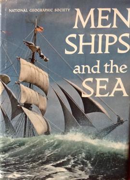
"I pulled out the paintings that had great artwork, especially those I admired in my father's collection of Fortune magazines."From February 1910 until August 1979, that most collectible of magazines, National Geographic, was recognizable by its yellow cover and its border of clustered oak and laurel leaves. Howard E. Paine of Delaplane removed them gradually, sometimes one at a time. He replaced the border with color photography. "We went ahead with glacial speed," Paine said. Leaf clusters were still visible nearly 20 years after he began altering the time-honored covers in September 1959. "We didn't want members writing in with, 'Where are my oak leaves?' " I observed how enthusiastic he was as the changes occurred, for we were colleagues at National Geographic in the 1960s. He was in charge of the magazine's design and typography, a post he held until his retirement in December 1990. Paine's August 1957 entree into the hallowed halls at 16th and M streets NW in the District followed an unlikely path, not that of the bevy of renowned scientists, writers and photographers who staffed the world's largest scientific and educational organization. He had never studied art or design. "I think it was all in my genes. My mother's father was a woodcutter," he told me recently at his home. Observation helped, too. "I learned an awful lot about magazines looking at them as a kid," he said. "I pulled out the paintings that had great artwork, especially those I admired in my father's collection of Fortune magazines." They are still among his research materials. After graduating as a philosophy major in 1950 from American International College in Springfield, Mass., Paine worked in his father's electrical appliance and fixtures store in Springfield. He had only two publishing credits: editor of his high school and college yearbooks. A college friend, Salvatore Giansante, knowing that Paine was smart and remembering his editing the yearbook, said to him, "Paine, what are you doing here?" So Paine left the family electrical business and began writing and designing ads for a bank and advertising firm. To keep abreast of his new field, he subscribed to Advertising Age, Publishers Weekly and the New York Times. In the Times, he answered an ad for an editor-designer for books about "science, geography and the world around us," as Paine recalled the wording. "I always loved books, so I replied to the box number. I thought the ad was from Golden Books, but after a few months I got a call" from a National Geographic senior officer."I had a portfolio of stuff," Paine said of his meetings with magazine staff members, "but I knew it was not what they wanted." "This is what I showed them," Paine said to me. And, 52 years later, on his Delaplane parlor table, he penciled the drawing that got him the job: "an imaginary travel book, 'Walking the Streets of Paris,' " he said, as he sketched a river, houses and trees. "I called the author Nicole Pouisson, or something like that." In August 1957, he, his wife and baby and 54 cartons of books settled in Fairfax County, his initial Virginia home. But on his first day after the move, Paine got appendicitis, and he spent the next few weeks in a hospital while the Geographic sent him materials for his first assignment, designing "The National Geographic Book of Dogs." The 1958 book sold well and impressed his colleagues, including John Schofield, a senior editor. He knew that the magazine's new editor in chief, Melville Bell Grosvenor, wanted photography on the cover, and he asked Paine to attend a meeting with Grosvenor. The others attending "were all word types, so I guess that's why I was invited," Paine said. "I want to put a picture on the cover," Paine remembered Grosvenor (known to staff members as MBG) saying in early 1959. Paine deferentially spoke out, recalling that he said something like, "Well, we'll have to reduce the width of the border and take out the word 'Magazine' from the title." "Everybody, to my surprise, agreed," he told me. "Melville would say, 'You know what I want, and you all go and do it.' " A Canadian, Robert Weir Crouch, designed the border that would be narrowed and finally removed. Its oak leaves represented longevity and strength, the acorns rebirth. Centered on the borders' four sides were the Earth's four hemispheres -- north, south, east and west -- the scope of the society's work in a world not yet part of space. Garlands of laurel leaves at the top symbolized achievement. There had been a few photographs on National Geographic covers. A U.S. flag graced the July 1942 issue and appeared on each ensuing July issue, except for 1944, when a savings bond took its place. In July 1959, the U.S. flag with an added star for Alaska appeared. Tradition soon broke. In September 1959, a small fighter jet appeared on the cover. The next month, the first person appeared, the torso of a female swimmer resting at poolside. Slowly the photographs got bigger and bolder, and on the July 1962 cover a costumed Tahitian woman occupied nearly the entire area inside the border. "The" had been removed from the magazine title in March 1960, and "Magazine" disappeared with the September 1966 issue. "The face is just magic," Paine said of his later cover photos. "I favored a big head, whether it was a pretty girl or a tribal chieftain -- even the portrait of an animal. A portrait is a compelling logo." As Paine redesigned National Geographic covers, he also designed books. His "Atlas of the Fifty United States" of 1960 was followed in 1963 by the first edition of "Atlas of the World." Both projects, the first atlases published by the society, were, Paine recalls, the idea of his boss, Grosvenor. "Men, Ships, and the Sea," by Alan Villiers, is the title Paine points to when asked to name his favorite book design project. He's especially proud of the buckram cover, similar to sailcloth. The book sold for $9.85 postpaid when it came out in time for Christmas 1962 and sold more than a million copies. It's a collector's item today. He showed me his autographed copy from Villiers and Grosvenor, who wrote: "The Society's layout genius also guided the production of this magnificent book and is responsible for every page." Paine's versatility extended to three dimensions in the early 1960s, when Grosvenor asked Paine to design Explorers Hall, the first floor of the society's new headquarters at 17th and M streets. Opened in 1964, the hall's centerpiece remains an 11-foot-diameter globe offset in a rectangular pool of shallow water glittering with tossed coins. In 1967, society President Melvin M. Payne (no relation) asked Paine to design a trademark for National Geographic. Payne had suggested a miniature of the magazine cover. Howard Paine agreed in part but urged that the yellow border stand alone, without interior material -- "clean, bold, simple, modern," to quote Paine. First used in the 1970 book "Hawaii," the yellow rectangle remains the society's trademark. Following his retirement in 1990, one of Paine's many continuing layout ventures is to oversee the design of U.S. postage stamps. He chooses and coaches the artists, some of whom he first admired when he cut out their paintings some decades ago. I asked Paine about his artistic credo. "Learning by the baleen method," he said. "The baleen whale will gulp a huge amount of ocean and squirt it all out except for the shrimp and morsels to eat. I take in everything and then spit out what I don't want." Article written by:
Cathy Hunter, archivist of the National Geographic Society, provided information for this report. Eugene Scheel is a historian and mapmaker who lives in Waterford. |
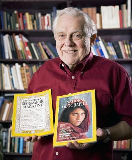 Howard E. Paine of Delaplane gradually altered the venerable leaf-cluster border of National Geographic.
(Adam Paine)
    |